Memorial
Find. Remember. Care.
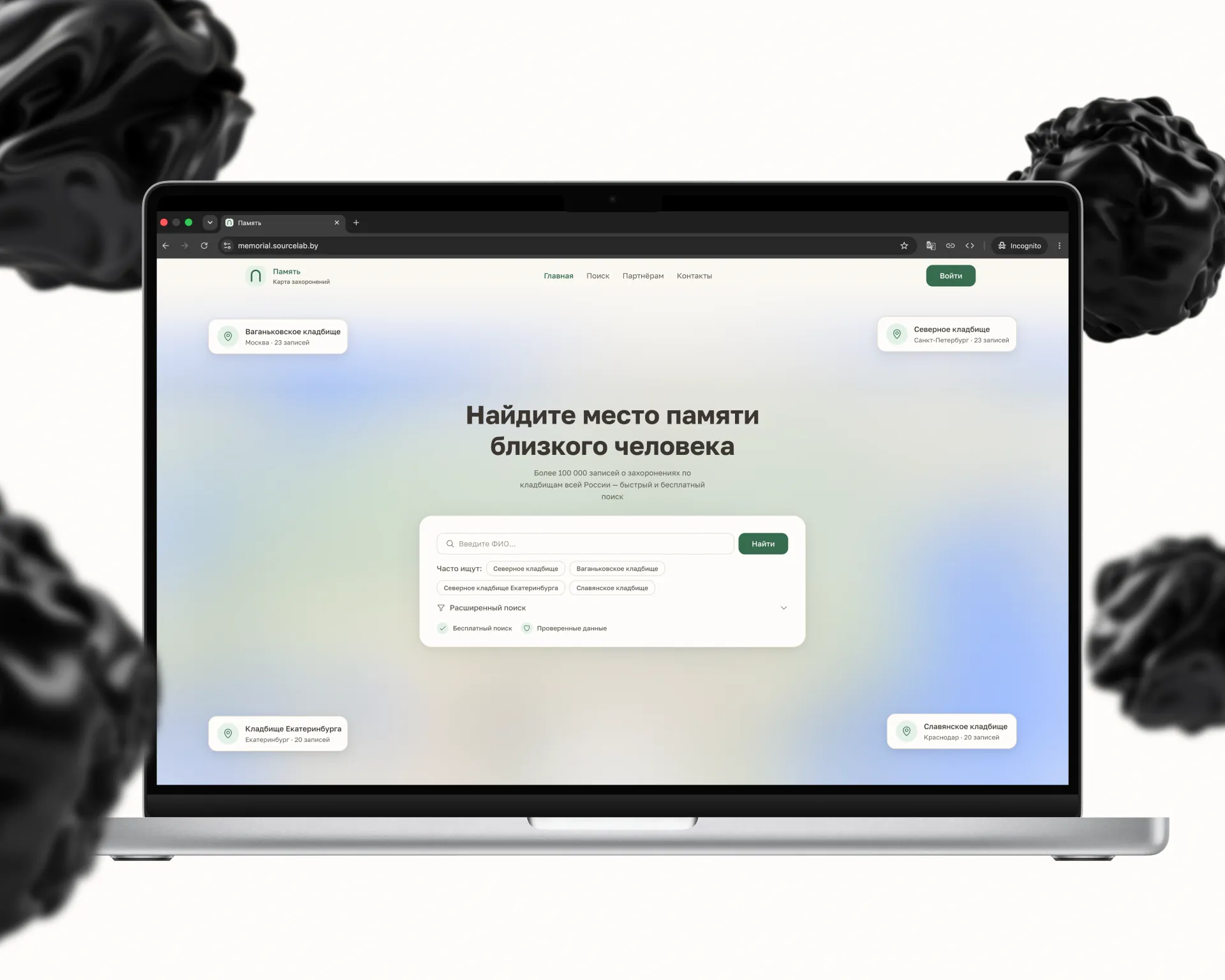
Memorial is a platform for finding burial sites across the country and connecting families with local service providers for grave care and memorial services. The product combines a nationwide burial registry search with a vetted freelance marketplace for specialists — from grave maintenance to monument restoration.
The memorial services space is deeply personal and rarely digitised. Families searching for a loved one's grave need a calm, frictionless experience — not a busy marketplace UI. At the same time, service providers need discovery and trust signals. Bridging both use cases without compromising the emotional sensitivity of either was the core design challenge.
We designed two distinct but connected flows: a map-based burial search with clean filtering, and a minimal service marketplace anchored by provider reviews and transparent pricing. A neutral, respectful visual language — muted palettes, generous whitespace, no gamification — keeps the experience appropriate to its context.
- Next.js
- React
- TypeScript
- TanStack Query
- TanStack Table
- Radix UI
- Motion
- GSAP
- NestJS
- PostgreSQL
- Prisma
- MapLibre GL
- Socket.IO
- Auth.js
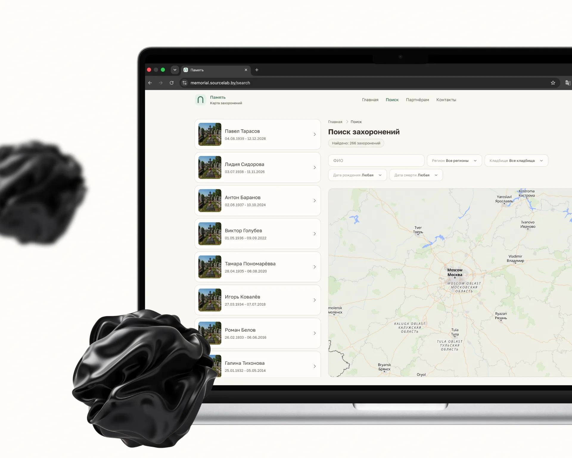
A nationwide map of burial records
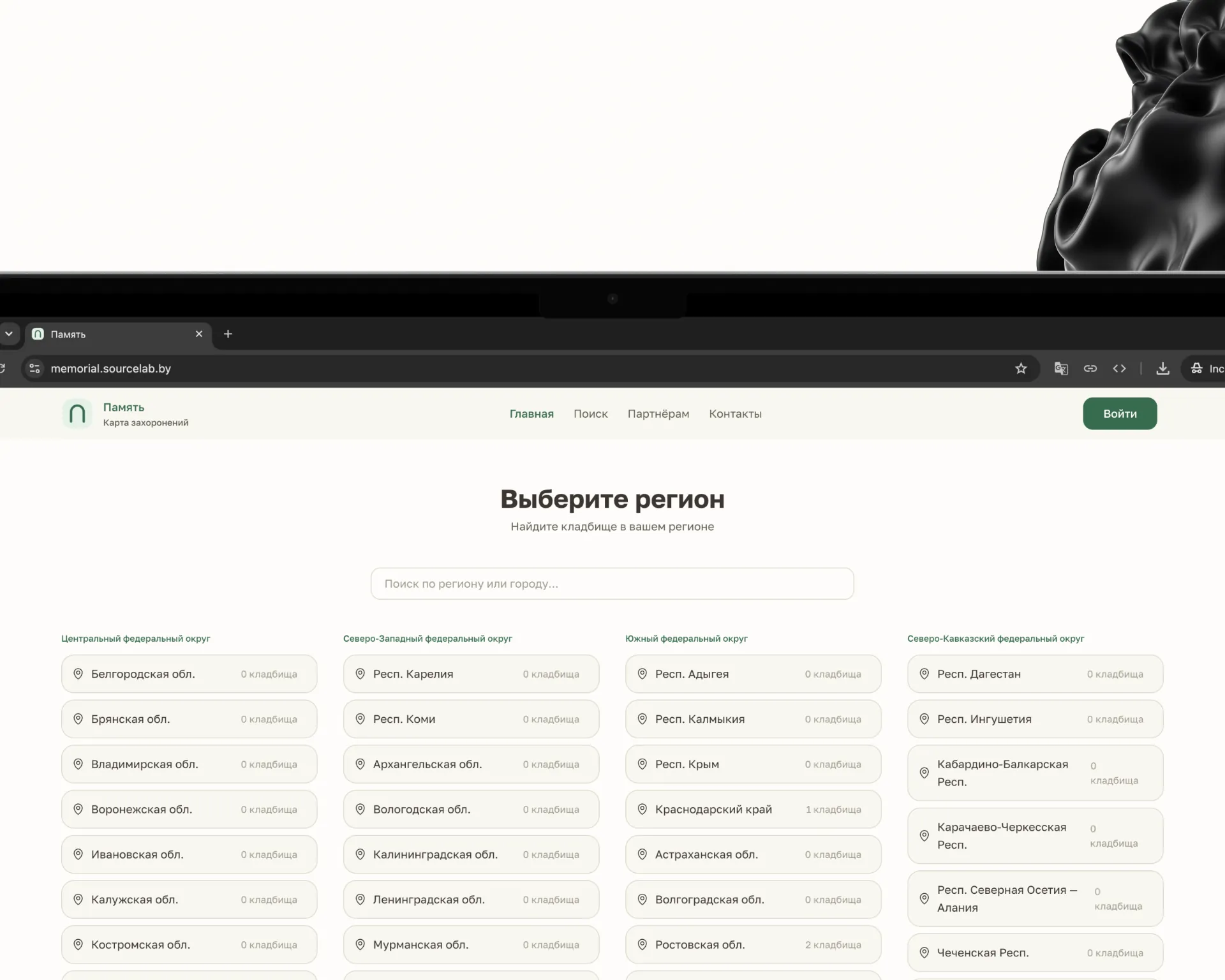
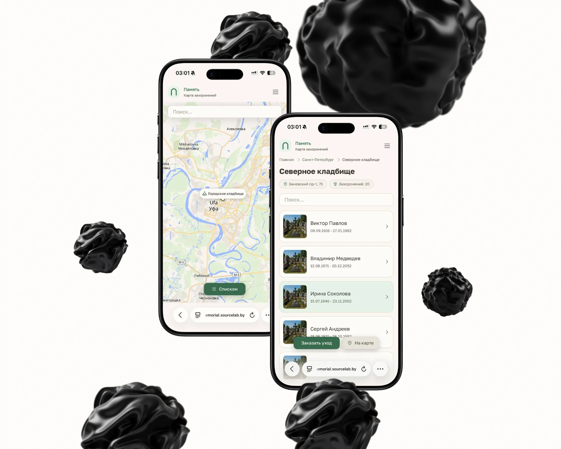
The search starts with a name: over a hundred thousand records, filters by region, cemetery and dates, results beside the map. A catalogue of regions and cemeteries opens the same path from the other end — from a city down to a specific plot.
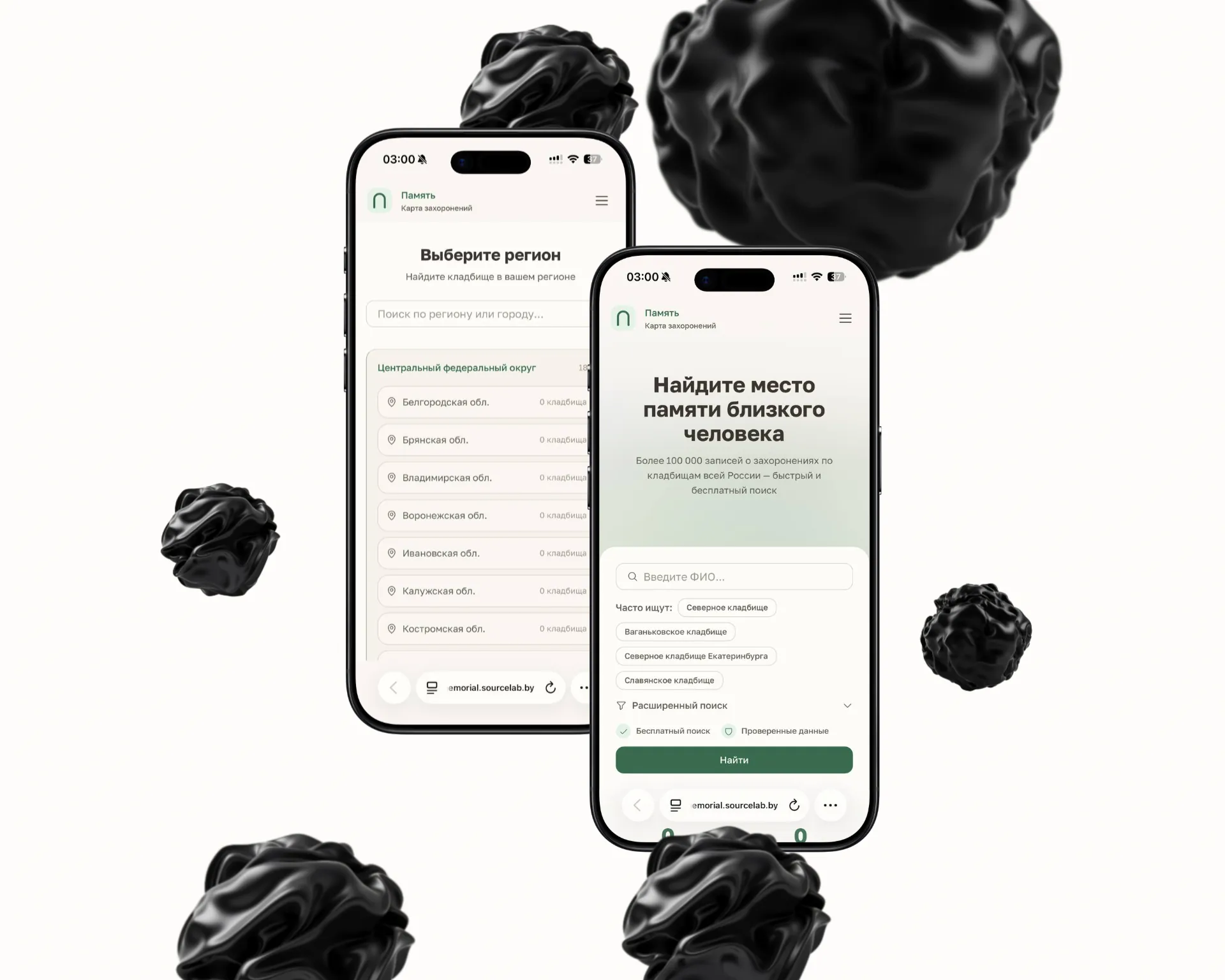
A place of memory, with photographs and a map
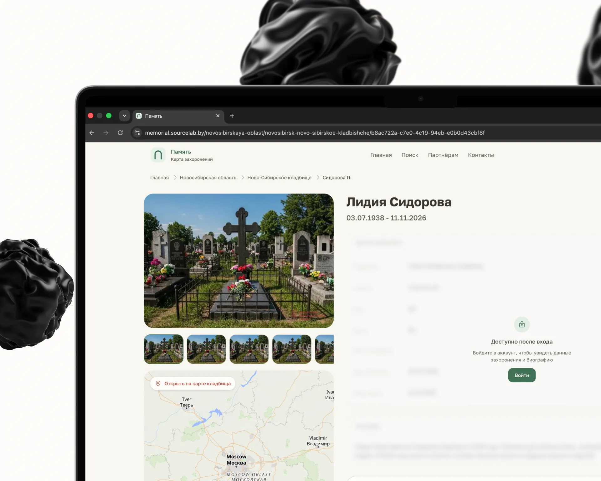
A burial page gathers photographs of the grave, dates, the plot number and its point on the cemetery map. Personal details and biography open after sign-in, so the database stays useful for search and closed to casual browsing.
An arch instead of a cross
The Memorial mark is an arch on two legs: the form reads as an entrance and as a vault, yet belongs to no denomination. For a product used by families of every background, that was a condition.
Vault
A semicircle on straight shoulders — a single stroke, 8 units of 112 wide.
Legs
Two short strokes below open the form up and set it on the ground.

Mark
A pale green square with a 32-unit radius — a quiet carrier with no contrast of its own.
One family, four weights
Golos Text, latin and cyrillic, covers the entire product — there is no second family in the project. The scale is short and strict: 32 for a page title, 24 for a section, 18 for a card, 14 for body. Where people read dates and names, predictability beats expression.
Grave care, ordered online
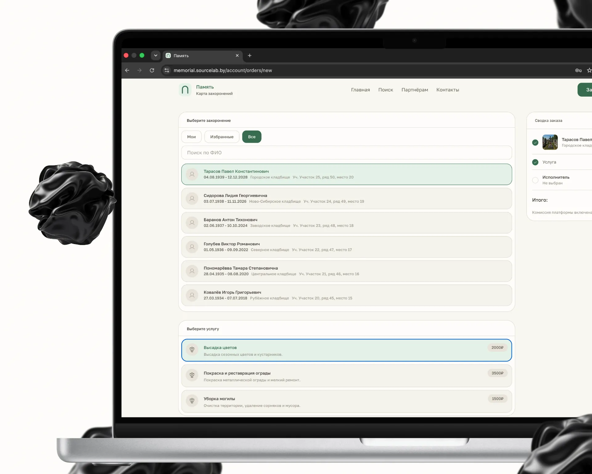
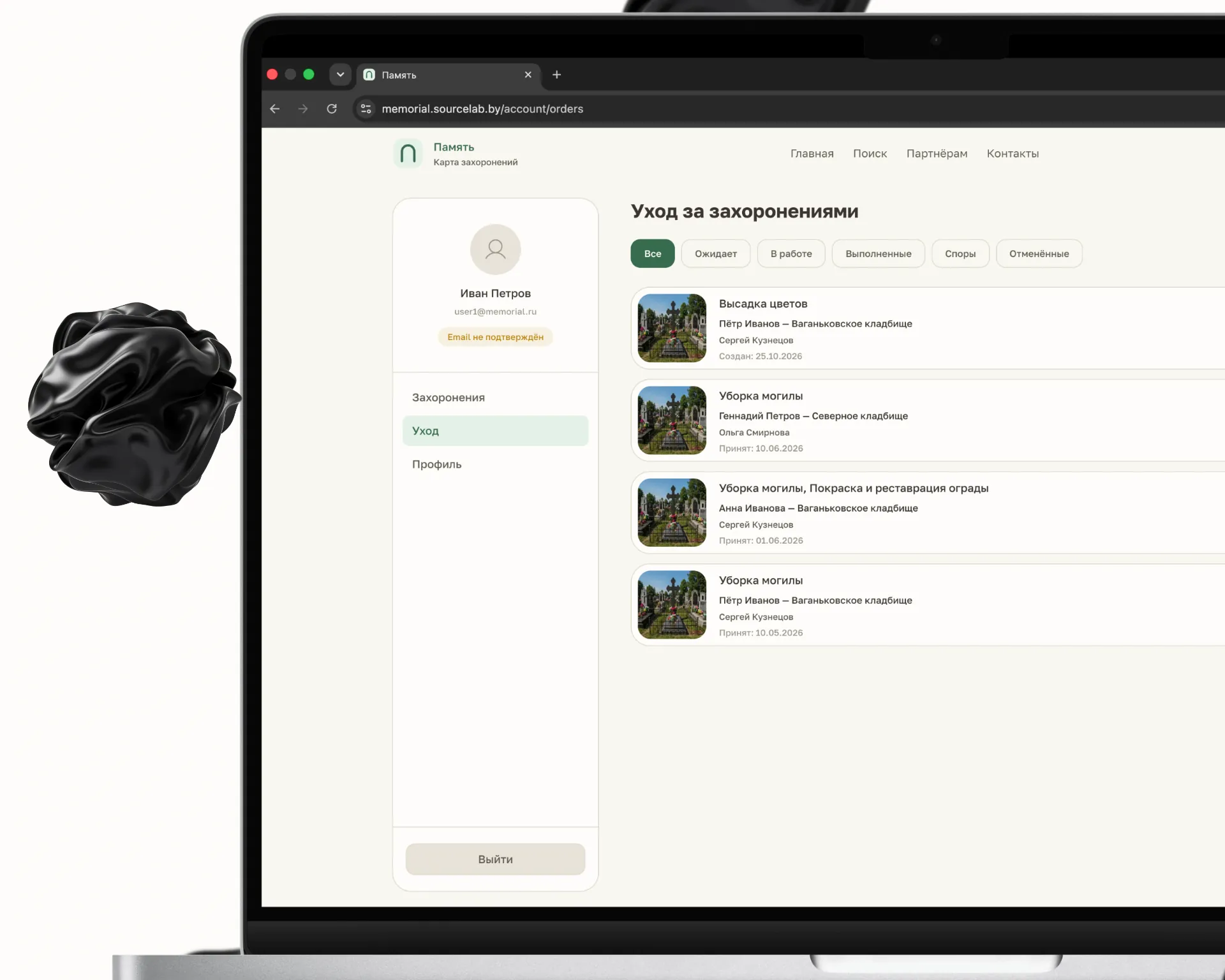
Choosing a burial, a service and a contractor takes a single screen: planting, fence restoration, cleaning — each with a price and a description of the work. The account lists every request with its status, and the contractor confirms the job with photographs.
Legible at sixteen pixels
The gap between the legs and the vault is the first thing to close up. The stroke weight was tuned so the arch never turns into a solid block in a tab icon.
Moss, sage and paper
Moss
A muted green for buttons, active states and the mark itself. Nowhere in the interface is it pushed further.
Sage
The pale bed behind the mark and the selected rows: a soft highlight with no borders or shadows.
Paper
A warm off-white page background takes the clinical edge off pure white.
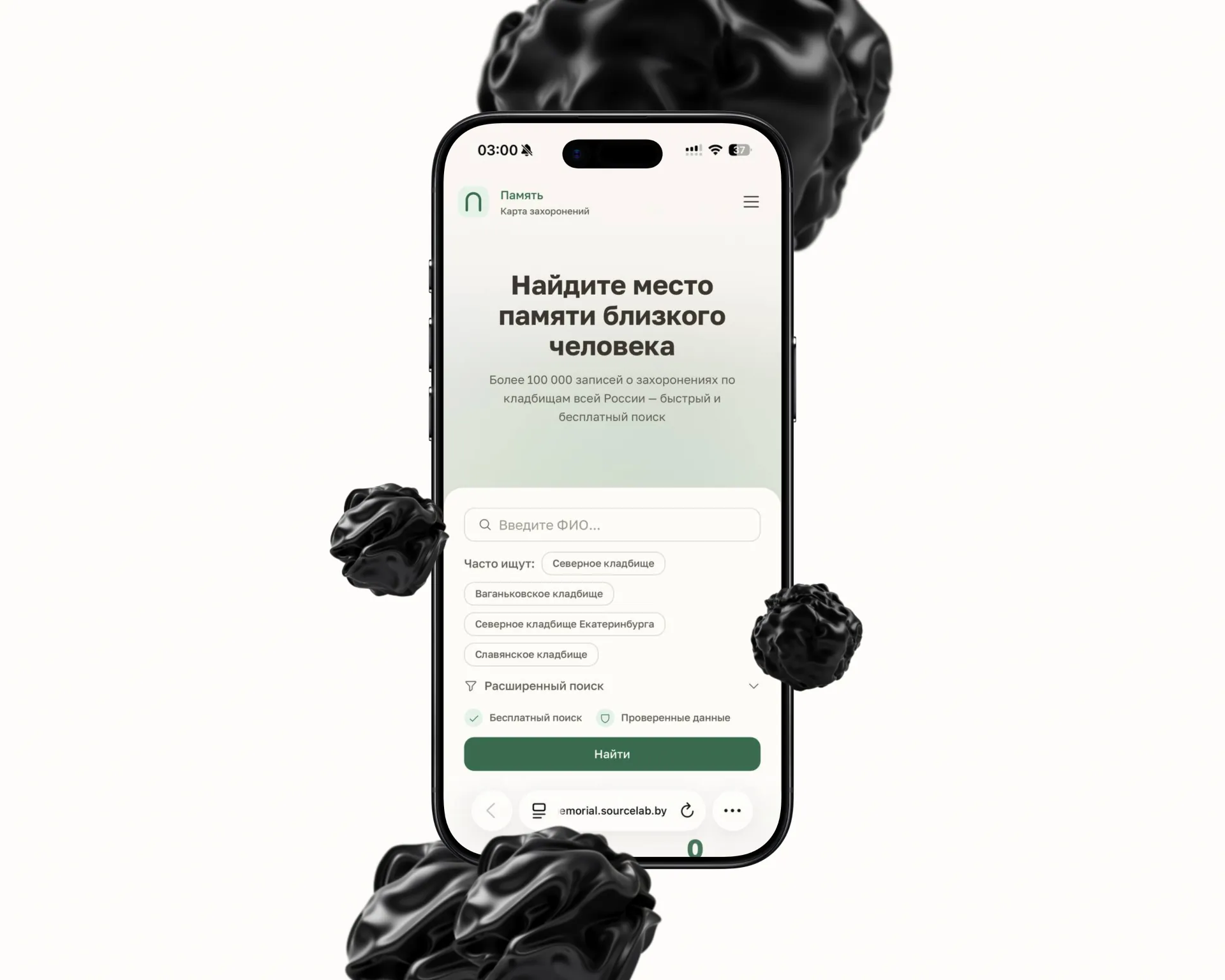
Find the resting place of someone you loved
Over 100,000 burial records across cemeteries nationwide — a fast search, free of charge.
Dates of life, plot numbers and record counts are what people come for, so they are set in the same text weight, with no decorative treatment.
The room where the platform runs
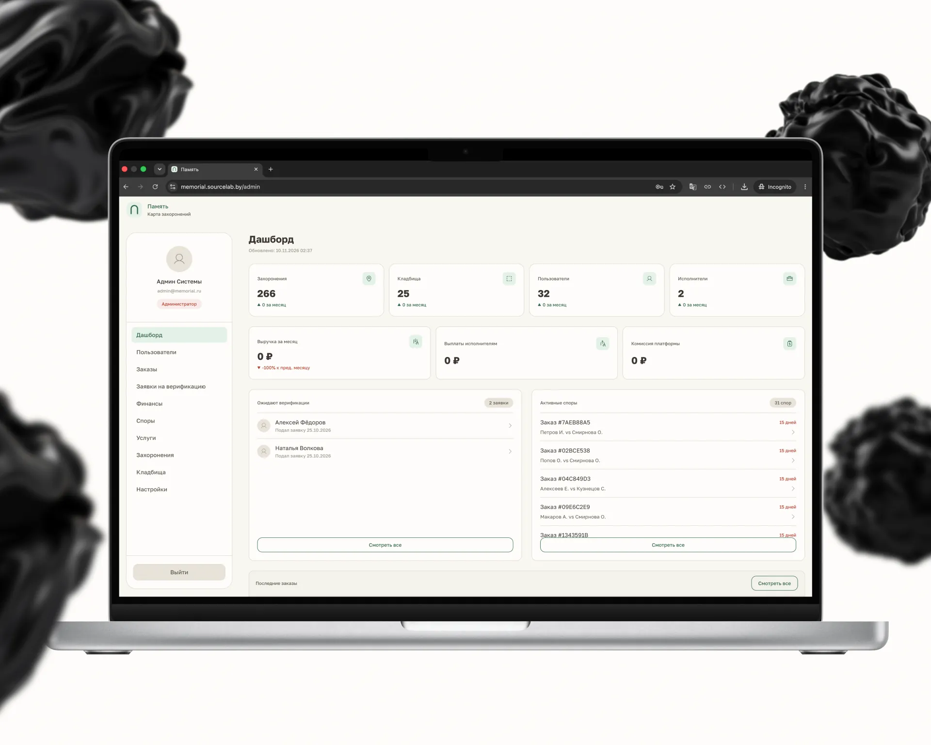
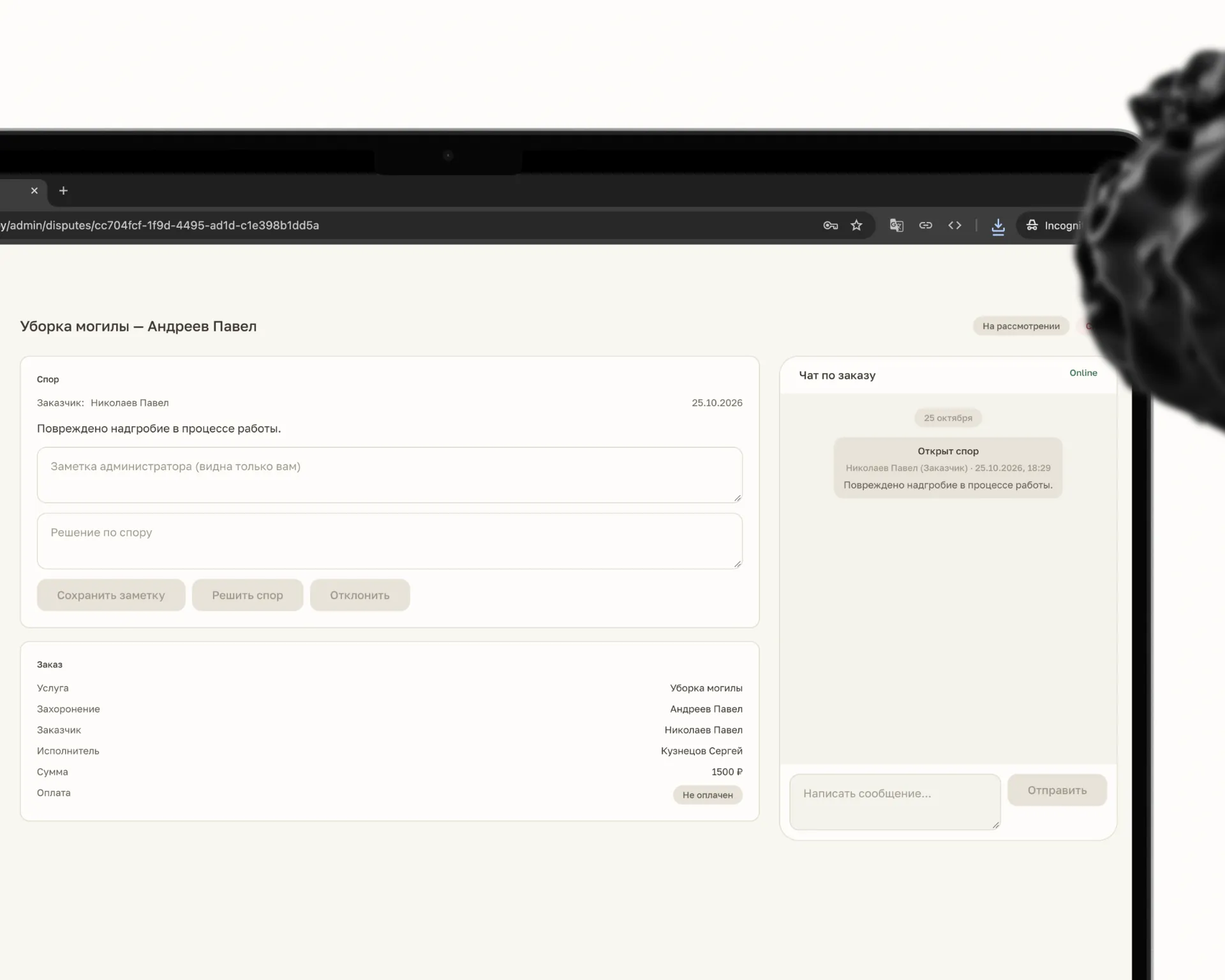
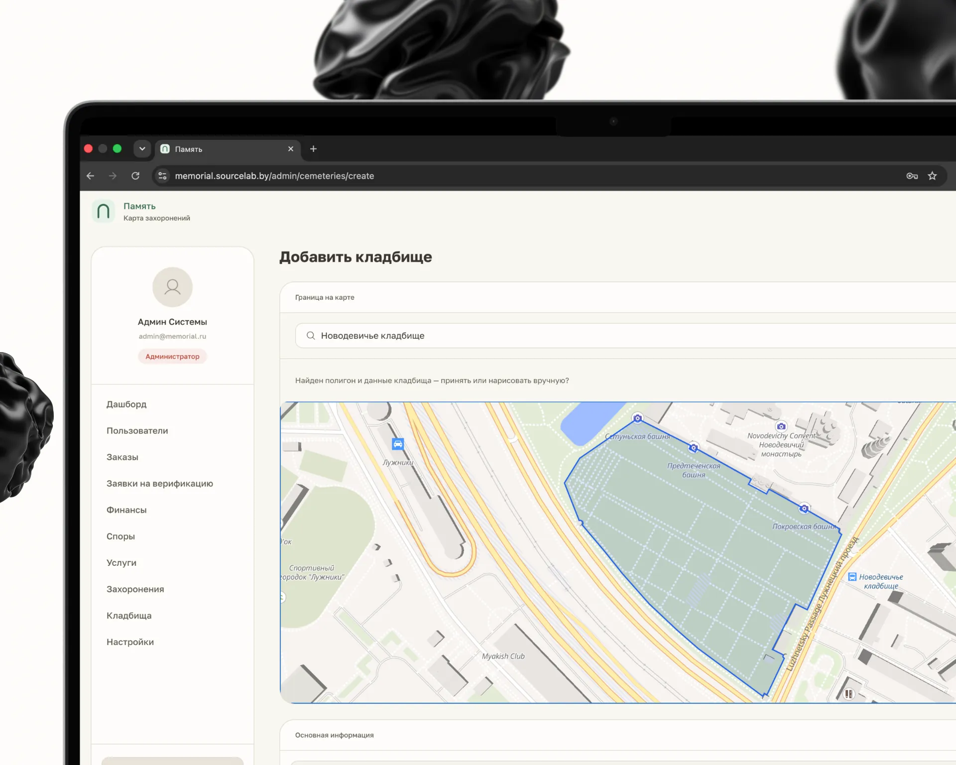
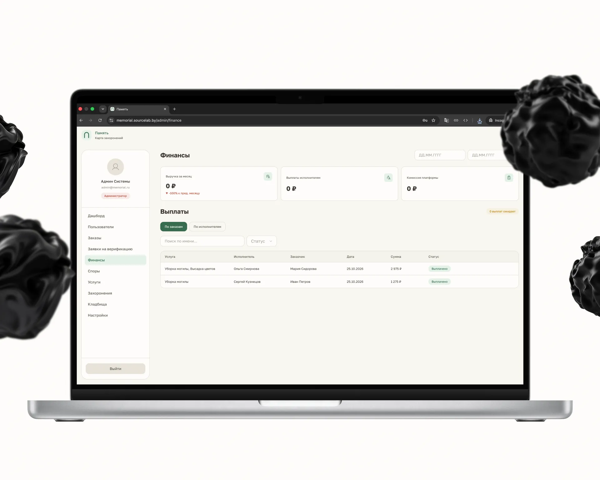
The admin panel covers the other half of the product: users and roles, orders, contractor verification, finance and payouts. Cemeteries are added on the map with their boundary pulled in automatically, and an order dispute is settled in a thread with both sides present.
Have something similar in mind?
Tell us about the project — we will come back with an estimate and a launch plan within a business day.

